Friday, 28 November 2014

WIX.COM/ STEP 4/ FONT

I presented my website to Phil saying that this is my first draft which is based on the material I found online. I talked about four websites and the research on them. Afterwards, Phil told me that I need to work on the background and fonts. I decided first of all focus on fonts and then work on the background because Harry didn't finish with the photoshoot and I didn't have enough materials to upload on the website and decide which picture to put on the main page as a background. 


Therefore I started to try different fonts on the title and here are several examples:


The main problem was to make a website look combined, make it look as a single product so the first difference was that the TITLE OF THE WEBSITE and the TITLE OF THE ALBUM had different fonts. I asked Harry which font he used in production of the digipack and used it for my website title. Also, I decided that that font can be used in every text on the website including the MENU, therefore I changed all the text and this what I finished with as our main web page.

Thursday, 27 November 2014

WIX.COM/ STEP 3/ MENU


 Previously I've seen on different websites that the menu is located differently and I know that the menu must be very approachable because it's very important tool used during surfing the internet on different websites. Therefore I need to think about the location of it and also the font so our menu will be seen by the audience and used regularly to transfer from one page on another. I looked at three different popular website of this music industry.

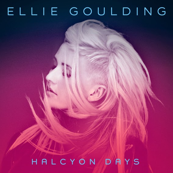
The first one is Ellie Golding website. Her website is very messy and it looks like it was produced by fans. However, there are many points of the menu and the audience can easily surf this website and find what it wants. This menu is located in the middle o the page under the title of the website so this makes it difficult to find. Moreover, the website is done in different purple-pink colour and this is why it's difficult to notice white font of the menu which doesn't work with the rest of the website.
The next website I looked at was Ed Sheeran's website. It is very simple but despite this there is lots of the information and also the manu is located on the clean background, it's not difficult find it and use in future. The menu is on the left side of the page and therefore it takes lots of place. The idea of the font an the colour  of it is very simple and can be used in my website however I don't like the location therefore I will prefer to make it on the top of the page horizontally.

The closest idea of the menu and font to mine had Owl City website, its font and menu are very simple but this doesn't make the website boring, it just makes the surfing simplier and therefore I prefer this type of the menu and will work on it.

Tuesday, 25 November 2014

WIX.COM/ STEP2/ TEMPLATE

 The first decision I had to make was the template of the future website. I found four different types of design and all of them are suitable for our theme.

The first one is a Lorde's website and it has a simple home page because it's just a website to represent a new album "Pure Heroine" therefore there are no links to other pages and it has only 7 links to other social networks like Twitter or Instagram, but they are separate from the website. Therefore this template can't be used in our production. However, I like the idea of the big photo used as a background therefore I asked Harry to take some pics this type so then I can use them in the website production.

The second one website of Foxes I liked because of its simple idea and bright colour. Also, my group has made just one video and one album therefore the representation of them both on the main page is very provocative and can attract the audience to look deeper into the website if the "front cover" will interest them. Therefore, I decided to have this template as the main one for my website production and keep this idea in mind. 

Next two templates do not present any bright ideas and design however, the Glasser website made me think about the font of the website and the colour of title. Moreover, I decide to play around with background on the third step of production. As we can see, on their main page the video is in the middle, so the attention is payed to it before the audience moves to the next page however, there is also a photo with an artist which is done in extravagant style and also can interest the audience in the website. 

The last website I looked at was Owl City website which has a traditional template represented on the WIX.com. However, its content is very big, they have plenty of videos and photos as well as blogs and chat with their fans. Moreover, their website consists of different fonts and colours. I didn't like it because it look like a mess. There are lots of information which is irrelevant and the structure is not simple and clear, it's difficult to find the right info and the audience can find it's useless.


Tuesday, 18 November 2014

WIX.COM / STEP 1

During this lesson I managed to start working on our website in WIX.COM, however I do not have any opportunities to present the final piece until Harry will finish with photos which I need to upload on the website so it can represent our artist.

This is how I started working on the website. I decided first of all to decide on the structure and font, so then it will be easier to renovate it and add some photos.

I have worked already in wix.com last year so therefore it is much easier for me this time.  I hope that the progress will be seen soon because the website development is very important for our group's work for this project.

I chose a Music Video Website Template as the format is right for our project. There is enough space for adding links like Instagram, Twitter, Facebook and other social networks through which we can promote our new star. Moreover, it is very important that users can listen to her songs online through Soundcoud.com and watch her performances and music videos online through Youtube.com. All these information I'm targeted to post during this week and start up our website so then fans can decide whether or not it is useful and comfortable to use.

Monday, 17 November 2014

Research into similar star image

Using WIX.COM our group need to produce a website which will be promoting Gen as a new star. The target audience are people who are interested in electro-pop music and can become real fans aged 15-25. Therefore this categorisation of people influences the design of the website and other extra products.

Firstly, I searched for artists who are similar in their music style and life style at all to Gen. I decided to work in the electro-pop and pop music industries so then the research can be not so spread.


Earlier, in our group we discussed that artists like Lorde, Soko, Ellie Golding and Taylor Swift are similar to Gen in their star image, appearance and the performance style. Therefore I had already some boarders in-between which me have to create Gen's image.


The deep research into these artists music career and their distribution campaigns, I realised that the closest to our artist is Lorde. Her website is extra ordinate and I took it as a model for our future website.

This lesson I used to find all the possible information and examples which then I can use to develop a website which will be recognised as successful for our final piece presentation. While I was doing this, Dmitry and Eden were working in editing suit and Harry was working on the digipack idea. 

Monday, 10 November 2014

Shooting day evaluation.


Today was the day X. We had 9 hours and during this time we needed to incorporate our ideas into useful in future footage and film everything what is possible in studio. We had everything prepared and were sure about the shooting as we came yesterday to the studio and talked to the light designer and builders. They made a major work and produced everything we needed for our music production. We chat a lot about our ideas with them so basically they knew what we were expecting and tried their best to embody our thoughts into reality. However, there was one problem which need to be solved quickly. We have ordered petals, the blossom which had to arrive on Saturday, 1st November, but there was a delay in 20 days therefore we should invent something what could replace the blossom. Phil and Eden decided to make confetti by themselves so it can be thrown up during the shooting and create the feeling of the snow falling down.

We made a shot list so during the shooting we could control what we need to do, be sure not to forget any important shots.

Shot list:

Mirror set
  • Jen (singer) wide shot
  • Jen close up
  • Jen long shot
  • Jen middle shot ( head and shoulder)
  • Maria (cello player) wide shot
  • Maria string close up
  • bow close up
  • Jacob (violin) wide shot
  • Jacob close up
  • string close up

Blue set
  • Jen wide shot
  • Jen close up
  • Maria and Jacob close up
  • Maria and Jacob wide shot
  • Dancers (Natasha and Romani) wide shot
  • Dancers close up
  • Dancers slow motion close up
  • Dancers body pic close up ( arms, legs, eyes)

Purple-dotted set

  • Jen wide shot
  • Jen close up
  • Maria close up
  • Maria wide shot
  • Maria and Jacob close up
  • Maria and Jacob wide shot
The real situation was completely different to our planning. Despite the shot list and schedule we were filming regarding what we see in front of the camera and how it works or not. Therefore the mirror set was at the end changed, for Jen close-up shots we built from these walls a small room and hand from the ceiling several light bulb. Therefore, our idea was changed and instead of an infinity room with a huge amount of small lights we had a small mirror room with 5 variously coloured lightbulbs.

We didn't divide our roles really however each of us had an important task which influence the whole development process. I was responsible for the make up and style therefore I spent half of the shooting day in the classroom, inventing different hair and make up styles for dancer, singer and cello player. However, I also took part in shooting and composition making, Dmitry and I decided whether or not we need to shoot players in the blue set with confetti and how they needed to be located around the set. Moreover, we all as a group decided on the lighting and I'm happy to notice that in this questions we felt into step.

We spent a lot of time on the first set therefore the major problem for us during this day was the lack of time, and therefore after lunch we decided to work faster and without any changes in the schedule. This decision helped us to save lot of time, moreover I assume that actors were already prepared for the shooing and they had enough rest so for the rest 3 hours we managed to finish other two sets. 

Personally, I believe, that the most successful shot was the close up of instrument players in the purple shot, I liked the background and the way we placed them in the set, Maria was sitting in front of Jacob and we can see her eyes watching the bow and his face looking straight. This shot is very artistic in my point of view and shows how the music and the set are greatly connected. All actors, dancers and players worked greatly, they were prepared and respondent with understanding to all comments, therefore we managed to finish on time and didn't spent lot of time on arguments. We, 
as a group were pleased with the work they've done during this shooting day and thanked them a lot.